Does your design system have a UX problem?
How we improved our design system by thinking about its ‘other’ audience

Zac Sanderson-Harris, Product Design Manager | 5 min read
There’s an old saying that you should never design for other designers. But when it comes to design systems, I’m not so sure. Here’s why I changed my mind, and why you should too.
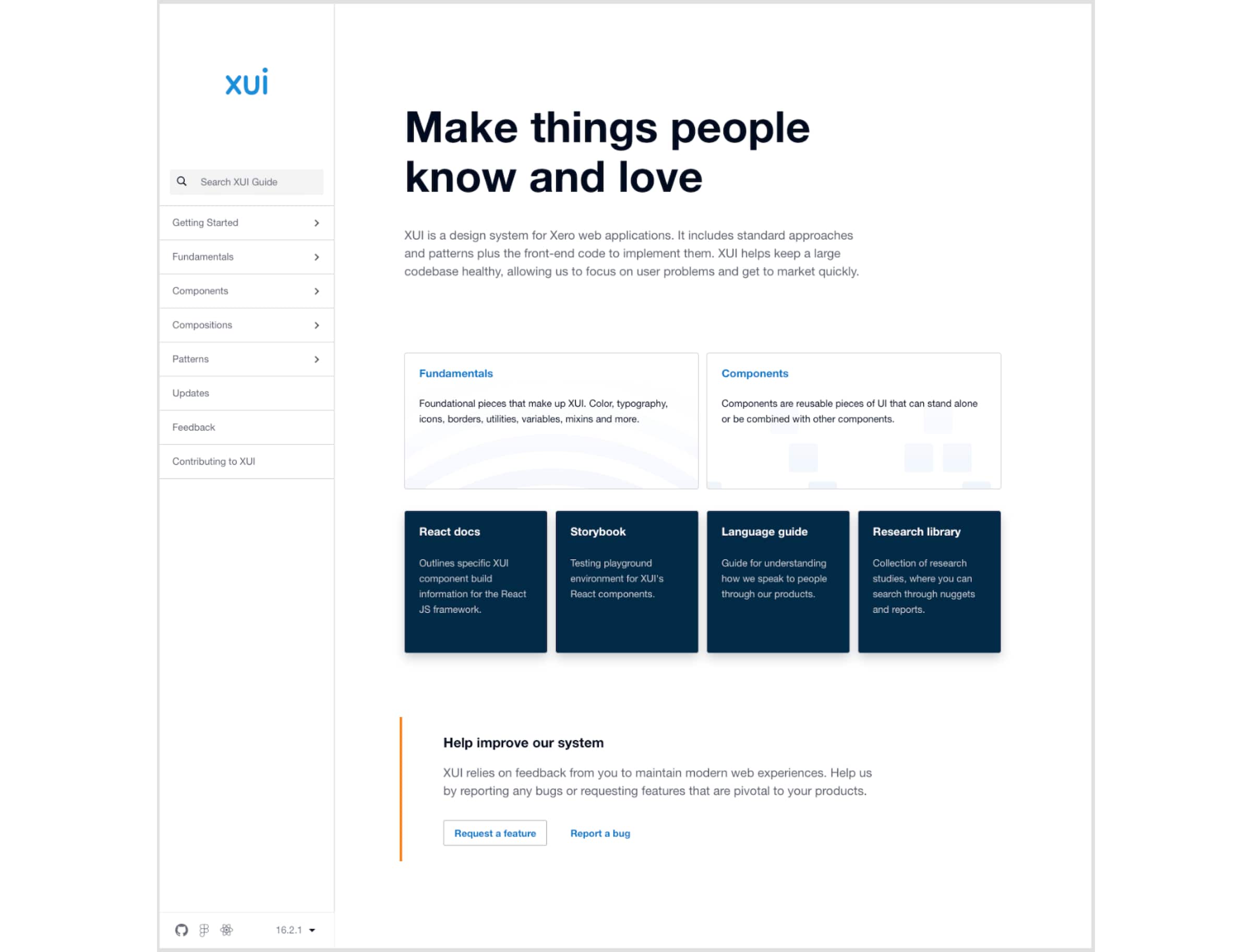
We call our design system XUI, which stands for Xero User Interface. It’s a world-class design system that has almost everything Xero designers and developers need to build user interfaces. The system provides a set of styles, components and page compositions, as well as guidelines around topics like responsive and inclusive design.
We’re constantly improving the usability and performance of our components. So when we release improvements, Xero teams can upgrade to the latest version of XUI and receive the improvements across their interfaces. It saves designers and developers a huge amount of time – instead of thinking about how a common element should look or behave, they can use one that already exists.
XUI not only ensures our interfaces have a unified look and feel, but also helps Xero designers and developers collaborate more effectively because they’re speaking the same language. Teams can then focus on solving customer problems, using the XUI system to build pages and experiences in a fraction of the time.
The problem with XUI
We’re proud to have a design system with high-quality components that function really well. But recently, we started to realise that designers and developers were having a hard time finding their way around the XUI Guide (our documentation website). The information architecture made sense to us, but when it came to our users, it wasn’t working.
An important part of our job is to be across what’s happening within different products around the business. That includes casual conversations around the office, as well as planned meetings where people can share any challenges, ideas or new requirements. It helps us get a lay of the land and see where improvements can be made, and it’s how we discovered we had a UX problem with XUI.
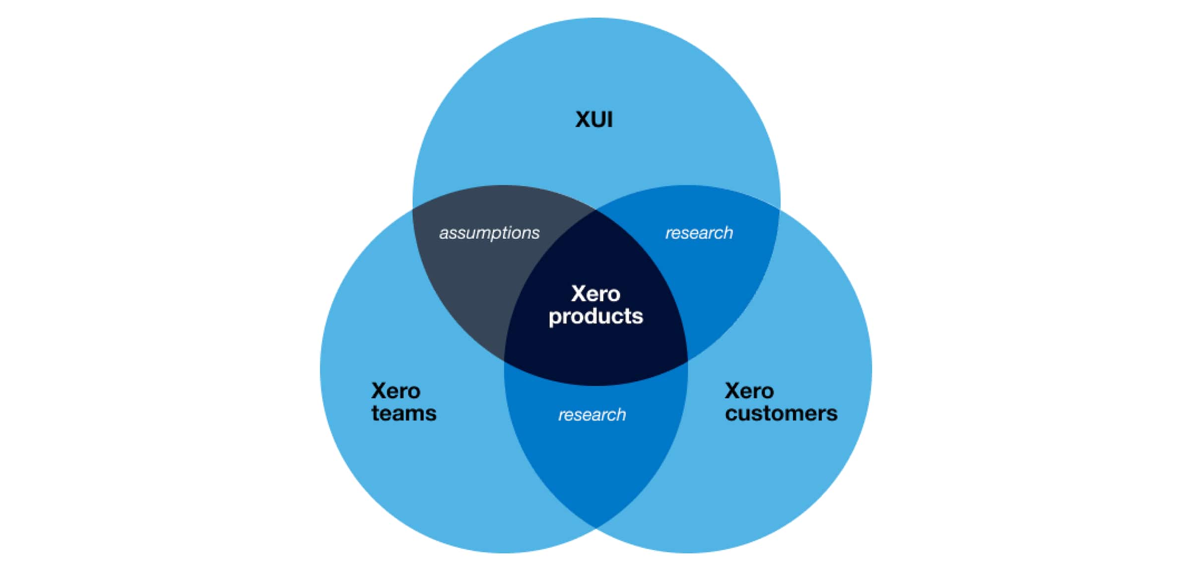
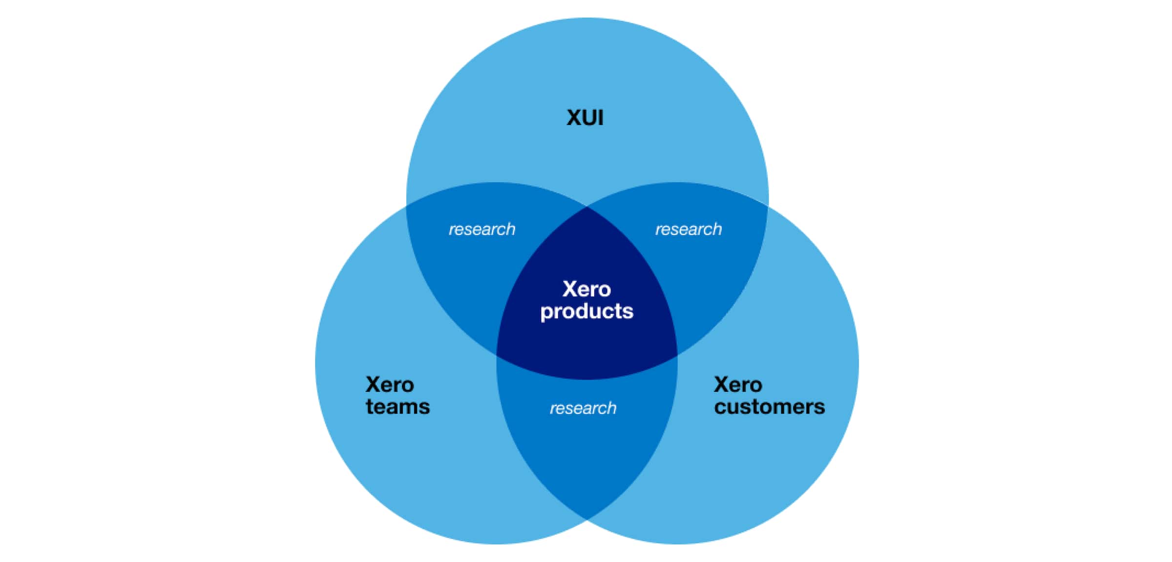
Why? Because while we were focusing on creating components for Xero customers, we were making assumptions about our other audience: the designers and developers who use XUI every day. And (surprise, surprise) those assumptions weren’t always correct. That was when we realised we need to test with both audiences: Xero customers and Xero product teams.
Getting our research on
So with the help of our superhuman research team, we set out to better understand how people were using the XUI documentation. We started by choosing a range of designers and developers from across Xero who have used XUI in different ways. Then, we held face-to-face and video interviews, as well as ran card sort exercises and surveys.
What we asked
The following high-level questions and tasks were given, and each spurred a more in-depth conversation:
- How do you use the XUI documentation?
- At which stages of a process do you use the XUI documentation?
- How do you go about finding a component you need in XUI documentation?
- How would you group the items from this list of components, and what would you call each group?
Interesting findings
The information gathered during this research phase was then analysed and compiled into a report, with plenty of insights and a handful of quick wins.
- Basing XUI’s navigation on atomic principles compromised findability. Atomic design is a sensible way to structure and build a design system, but participants didn’t find it useful when trying to find a component (note: XUI used the terms ‘Elements’ instead of ‘Molecules’ and ‘Compounds’ instead of ‘Organisms’).
“I don’t think to myself, what [group] does a table belong to? I just think of the table.”
- Designers don’t always know which component they are looking for. Sometimes they want to find out which component will best solve a particular problem.
“…you know you have some kind of need, but you haven’t determined which [component] is right.”
- Naming is hard. There’s a balance between expecting users to be familiar with industry-standard naming and relying on them to learn the names a system has decided to go with. Generally, participants accepted that component names vary between design systems and said they are happy to learn XUI’s particular nomenclature.
- Interviewing designers is an interesting challenge. On one hand, they see what you’re trying to do and sometimes jump straight to suggesting solutions. But on the other hand, they genuinely care about helping and are generous with their time and considered with their feedback.
Quick wins
We translated our findings into some ‘how might we’ questions, which help us consider opportunities at a high level. So, how might we empower XUI users to find relevant components without knowing the exact terminology? Or, how might we make it easier to find a component based on the problem it solves? This helped us kick-start the discovery work and spun out a few quick wins:
- We flattened the XUI Guide navigation so components sat in a single list rather than being split by atomic principles.
- We added ‘related links’ to the bottom of documentation pages to help provide alternatives for users who have not found what they are looking for.
- We introduced ‘search’ into the navigation to help users who already know what they’re looking for.
- We improved the visual clarity of elements in the documentation that are used the most.
- We scoped out work to provide documentation for implementing patterns and solving broader user problems.
The next evolution
Now that this phase of research is complete, we’ll be continuously testing the quick wins with our users and planning a redesign of the XUI documentation in the months to come. But the lesson is simple: We can’t focus purely on designing components for the end customer because they’ll only be used well if designers and developers can find them (and the accompanying documentation). There’s more to documentation than just pointing designers and developers to components.
You may not have an entire team dedicated to maintaining and improving your design system like we do at Xero. But if you’re working on a design system, you can stay connected to designers and developers on a regular basis and try to understand how they’re using the system, so you can find ways to make things easier for them. And of course, when someone asks you to consider your audience, you can say ‘which one’?
Thank you to my colleagues Isaac Minogue, Lucy Oldridge, Finn Clark and Charlotte Grey for their contribution to this work.